
Excel 2024: Tip: Replace a Long Slicer with a Filter Drop-Down
May 27, 2024 - by Bill Jelen

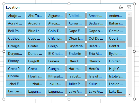
Slicers can get too large if there are too many tiles. This figure shows a slicer with 146 items. The Slicer is already too big, and you aren't seeing all of the tiles nor all of the text in the tiles.
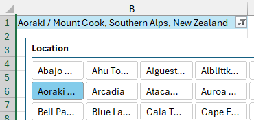
Create the slicer shown above but hide it out of view. Create another pivot table that is connected to this slicer. In the pivot table, put the Location field in the Filters area. This gives you two cells as shown here:
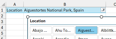
When you open the drop-down in B1 and choose a Location, the Slicer also updates. Any pivot tables connected to the Slicer will update.
With careful planning, you can hide column A. Then, it will appear that you have a single drop-down cell that filters all of the pivot tables. This takes up much less space than a slicer.
Thanks to Tine OzimiÄ for this idea.
Sparklines: Word-Sized Charts
Professor Edward Tufte introduced sparklines in his 2007 book Beautiful Evidence. Excel 2010 implemented sparklines as either line, column, or win/loss charts, where each series fills a single cell.
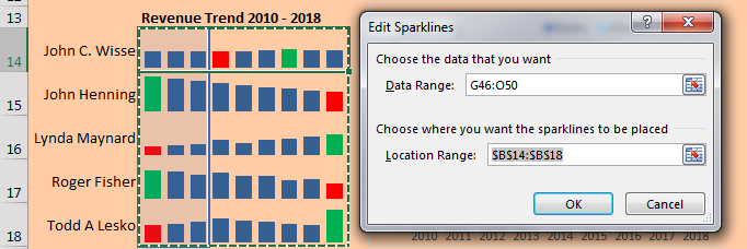
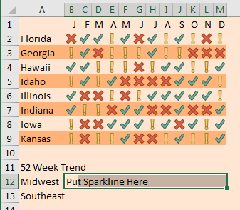
Personally, I like my sparklines to be larger. In this example, I changed the row height to 30 and <gasp> merged B14:D14 into a single cell to make the charts wider. The labels in A14:A18 are formulas that point to the first column of the pivot table.
|
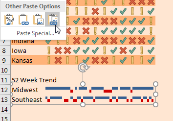
To change the color of the low and high points, choose these boxes in the Sparkline Tools tab: 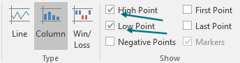 Then change the color for the high and low points: 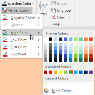 |
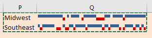
By default, sparklines are scaled independently of each other. I almost always go to the Axis settings and choose Same for All Sparklines for Minimum and Maximum. Below, I set Minimum to 0 for all sparklines. 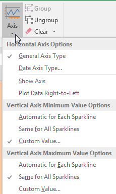 |
Make Excel Not Look Like Excel
Did you notice that many of the dashboards shown in the previous topics don't look like Excel? With several easy settings, you can make a dashboard look less like Excel:
- Select all cells and apply a light fill color to get rid of the gridlines.
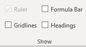
- On the View tab, uncheck Formula Bar, Headings, and Gridlines.
- Collapse the Ribbon: at the right edge of the Ribbon, use the ^ to collapse. (You can use Ctrl+F1 or double-click the active tab in the Ribbon to toggle from collapsed to pinned.)
- Use the arrow keys to move the active cell so it is hidden behind a chart or slicer.
- Hide all sheets except for the dashboard sheet.
- In File, Options, Advanced, hide the scroll bars and sheet tabs.
Bonus Tip: Line Up Dashboard Sections with Different Column Widths
If you are anything like me, you often need to fit a lot of data into a small area in a dashboard. What if columns in one dashboard tile don't line up with columns in another tile? Using a linked picture will solve the problem. In the figure below, the report in A1:M9 requires 13 columns. But the report in Rows 11:13 needs that same space to be two columns. I am rarely one to recommend merged cells, so let's not broach that evil topic.
Instead, go to another section of the workbook and build the report tile. Copy the cells that encompass the tile.
Select where you want the tile to appear. On the Home tab, click on the lower half of the Paste dropdown to open the paste options. The last icon is Paste Picture Link. Click that icon. A live picture of the other cells appears.
Thanks to Ghaleb Bakri for suggesting a similar technique using dropdown boxes. Ryan Wilson suggested making Excel not look like Excel. Jon Wittwer of Vertex42 suggested the sparklines and slicers trick.
Bonus Tip: Report Slicer Selections in a Title
Slicers are great, but they can take up a lot of space in your report.
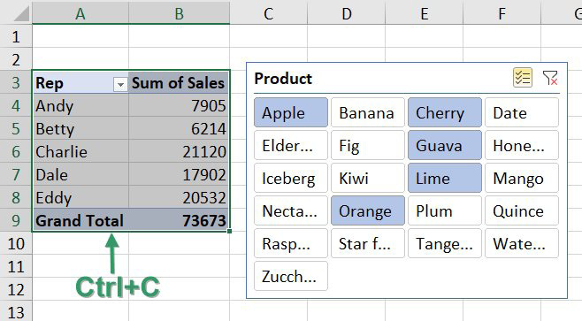
Here is an awesome way to get the selected slicers in a single cell. First, select your entire pivot table and copy with Ctrl+C.
|
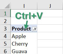
Then, paste a new pivot table somewhere outside of your print range. Copying and pasting makes sure that both pivot tables react to the slicer. Change the pivot table so you have the slicer field in the Row area. Right-click the Grand Total and choose Remove Grand Total. You should end up with a pivot table that looks like this: |
 |
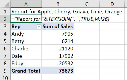
The list of products starts in I4 and might potentially extend to I26. Use the new TEXTJOIN function to join all of the selected products in a single cell. The first argument of TEXTJOIN is the delimiter. I use a comma followed by a space. The second argument tells Excel to ignore empty cells. This makes sure that Excel does not add a bunch of commas to the end of your formula result.
This article is an excerpt from MrExcel 2024 Igniting Excel
Title photo by Ruslan Valeev on Unsplash