Three easy visualization tools were added to the Conditional Formatting dropdown in Excel 2007: Color Scales, Data Bars, and Icon Sets.
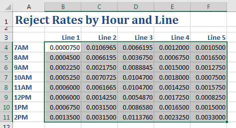
Consider this report, which has way too many decimal places to be useful.
Numbers in the grid show reject rates by hour and line. Down the left side of column A are the hours 7AM to 2PM. Across the top are five manufacturing lines. It is impossible to gain any meaning from this table, as the reject ranges have six digits after the decimal. It is a sea of numbers.
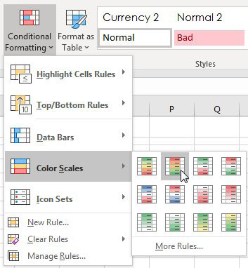
Select the numbers in the report and choose Home, Conditional Formatting, Color Scales. Then click on the second icon, which has red at the top and green at the bottom.
On the Home tab of the Ribbon, choose the Conditional Formatting drop-down menu. Then choose Color Scales. Choose the second tile, which has Red for high numbers, yellow for medium numbers, and green for low numbers.
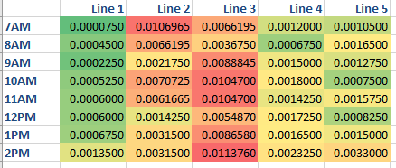
With just four clicks, you can now spot trends in the data. Line 2 started out the day with high reject rates but improved. Line 3 was bad the whole day. Line 1 was the best, but even those reject rates began to rise toward the end of the shift.
Each of the numbers with a reject rate is assigned a color from green (good) to red (bad). Now it is easy to spot trends. Line 2 started the day bad but improved to average. Line 3 started worse than average and stayed bad the whole day. Line 1 is mostly green, but towards the end of the shift, trailed off to yellow-green.
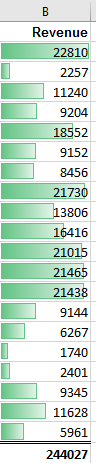
The next tool, Data Bar, is like a tiny bar chart that fills a cell. In the following figure, select all of the Revenue cells except for the grand total.
Choose Conditional Formatting, Data Bar, Green. Each number now gets a swath of color, as shown below. Large numbers get more color, and small numbers get hardly any color.
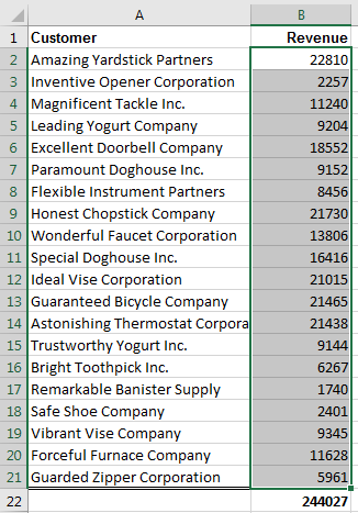
20 customers in A2:A21 with revenue in B2:B21. In cell B22 is a grand total of all customers. Only B2:B21 is selected, leaving out the grand total cell.
After applying a data bar, the largest cells have a green bar that covers most of the cell. The small cells have barely any green from the left. It is easy to spot the largest customers based on the bar chart right in the cell.
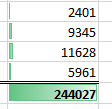
Caution: Be careful not to include the grand total before selecting Data Bars. In the following example, you can see that the Grand Total gets all of the color, and the other cells get hardly any color.
Contrast if you had included the Grand Total cell in the Data Bar range. The Grand Total gets all of the green and all of the other customers (even the large ones) get hardly any green, making them all look alike. The lesson: don't include any total cells in your Data Bar range.
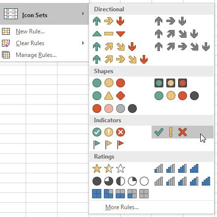
With the third tool, Icon Sets, you can choose from sets that have three, four, or five different icons.
There are twenty different icon sets available. The first difference is how many icons are in the set. Some have 3 icons, 4 icons, or 5 icons. Some use a traffic light analogy: Green, Yellow, Red circles. Some have arrows pointing up, right, or down. Some have Cell Phone Power Bars.
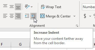
Most people keep their numbers aligned with the right edge of the cell. Icons always appear on the left edge of the cell. To move the number closer to the icon, use the Increase Indent icon, shown below.
In the Home tab of the ribbon, there are icons for Left, Center, and Right Align. To the right of those, are Decrease and Increase Indent. To keep the numbers right-alighned but to move them closer to the icon, use Right Align, and then click Increase Indent twice.
All three of these data visualization tools work by looking at the largest and smallest numbers in the range. Excel breaks that range into three equal-sized parts if you are using an icon set with three icons. That works fine in the example below.
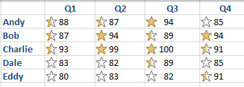
Five sales reps and four quarters worth of scores. The numbers vary from 80 to 100. Anyone in the lower third gets a white star. The top third gets a gold star. Right now, the stars are evenly distributed. Make note that Eddy in Q1 had a score of 80 as you move to the next image.
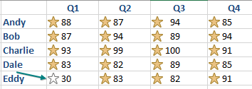
But in the following figure, Eddy scored horribly in Q1, getting a 30. Because Eddy did poorly, everyone else is awarded a gold star. That doesn‘t seem fair because their scores did not improve.
Mostly the same data, but now Eddy has scored 30 in Q1 instead of 80. All of the icons have changed to Gold Stars, because compared to Eddy's poor performance in Q1, everyone else falls in the top third. This shows why accepting the default settings for icon sets is not the best way to go.
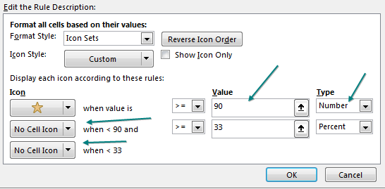
You can take control of where the range for an icon begins and ends. Go to Home, Conditional Formatting, Manage Rules and choose Edit Rule. In the following figure, the Type dropdown offers Percent, Percentile, Formula, and Number. To set the gold star so it requires 90 or above, use the settings shown below. Note that the two other icons have been replaced with No Cell Icon.
This shows several settings changed in the Edit The Rule Description dialog. First, the Gold Star is now assigned to a Number >=90. (You have to choose Number instead of Percent from the far right drop-down first.) Rather than choosing a number for the second and third icons, the leftmost dropdown menu is changed from the star to "No Cell Icon" for the second and third icons.