Pareto Analysis in Excel
August 06, 2005
To try this tip on your own computer, download and unzip CFH236.zip.
Today, you have a dataset showing a list of manufacturing defects from the past year of data. There are over 11,000 rows of data. The columns show the date of the defect, the assembly line, and the type of defect. With 11,000 rows of defects, you want to do something to improve the quality, but where do you start?
A type of analysis that seeks to find which problems occur most often is called a pareto analysis. It makes sense - to fix quality problems, find out which problems occur the most and find a way to fix those problems.
A pivot table allows you to quickly find which problems are happening most often. However, it requires some fairly deep pivot table techniques.
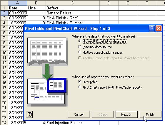
Select a single cell in the data. From the menu, select Data - Pivot Table and Pivot Chart Report.
If you are using Excel 2000 or newer, you can simply click finish in Step 1.
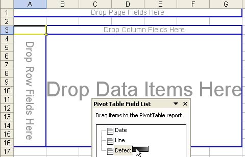
You will be presented with a blank pivot table. You will drag the Defect field from the Pivot Table field list to the "Drop Row Fields Here" area of the pivot table.
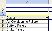
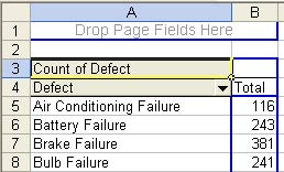
Dropping the Defect field in the Row area will provide a unique list of defects. Next, you want to get a count of how many times each defect occurs. Usually, pivot tables want to sum a field, but you really don't have any fields to sum in this case. If you drag a text field to the data area, Excel will automatically decide to Count the field instead of Sum the field.
You now have a list of defects and the numbers of times that each has occurred.
Your next goal is to make the report sort so that the most common defects appear at the top and optionally you can limit the report to show just the top 15 items. Double-click the Defect button in cell A4 to open the PivotTable Field dialog box. I told you that the settings for a pareto analysis are fairly deep. To get to them, you need to choose the Advanced button in the PivotTable Field dialog box.
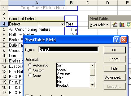
Choosing this button will open the PivotTable Field Advanced Options dialog box. In this box, you can control the AutoSort and AutoShow options.
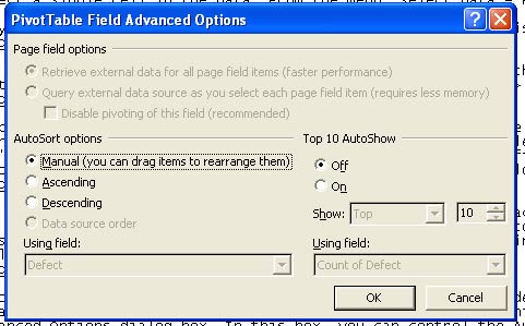
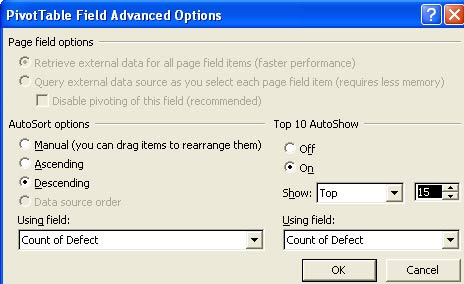
On the left side of the dialog box, choose the Descending button. In the Using Field dropdown, choose Count of Defect. On the right side of the dialog box, Choose to turn on the Top 10 AutoShow feature. Although the feature is called "Top 10", you can use the spin button to change from 10 to 15 or any number. You could also show the bottom 10 or any combination. Once you have all of the settings correct, your dialog box will look like this one.
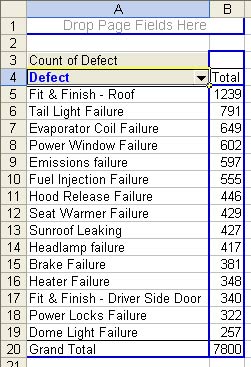
This pivot table shows you the 15 most prevalant problems in the data. This is extremely useful information. The data shows that if you can solve the Fit & Finish problems with the roof, you would solve 1239 defects.
It would be interesting to see if you can learn anything more from this data. For example, is the problem isolated to one assembly line? In the image above, cell B3 is still the spot where you would drop a field to add the field to the Column Area of the pivot table. From the Pivot Table Field List, drag Line and drop it in cell B3. The resulting pivot table is shown below. This data is interesting. While the Tail Light Failure defect happens across all assembly lines, there is something going on with the Roof Fit & Finish. Line 2 has far more problems than the other assembly lines.

You can focus more on the top defect. Drag the Defect field to the Drop Page Fields Here in A1. Moving a field to the PageField will give you a dropdown showing the the table is showing all values for that field.

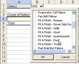
Choose the dropdown in B1. Scroll through the list to find Fit & Finish - Roof. Choose that item and select OK.
The result will be that you can see the total defects by line for the Roof Fit & Finish.

Drag the Date field from the PivotTable Field List to cell A4 in the image above. This will show the data by day. As you scroll through this data, you will see that there were 1-2 problems a day on line 2 throughout the month, but on August 28, something happened to send the defects through the roof.
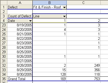
At this point, you can go to check the plant to find out what happened on the 28th. Did someone go on vacation? Did a piece of equipment fail? After using a pivot table in Excel, you will have a clue where to start looking. The Pivot Table allowed you to weed through 11,000+ rows of data to isolate the worst problems in the plant.
Tips from this episode are from Pivot Table Data Crunching.
